
Refreshing the face of NYCProsthodontics
Modernizing the visual identity of NYCProsthodontics | Rebranding a prosthodontics practice for the future
Services Provided:

Opportunity
A longstanding NYC care team considered a rebrand as their senior partner neared retirement. In an effort to refresh their visual identity, modernize their online presence, and highlight their practice values across all branded touchpoints, the team at NYCProsthodontics collaborated with REIT for the rebrand.
Approach
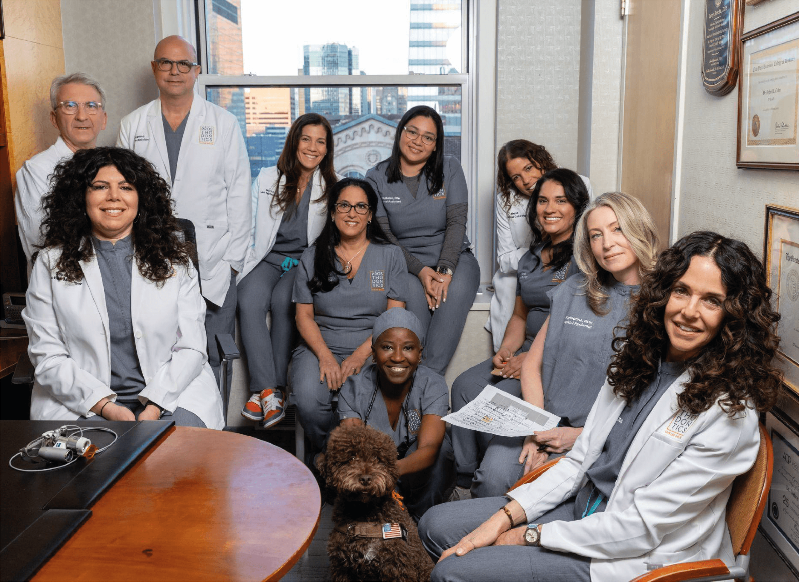
REIT collaborated with the entire staff of NYCProsthodontics (including their therapy dog, Marcel!) to concept, develop, and design the rebrand. REIT created a visual identity that reflected NYCProsthodontics’ expertise and their comprehensive practice approach, balancing science, art, innovation, and care. Supplied with research on the industry and the background of NYCProsthodontics, we crafted their new brand architecture, revamped their online presence, and refreshed their branded assets.
Solution
We provided several design options that combined their desire for professionalism and modernity, putting NYCProsthodontics ahead of the pack. From there, we collaborated on a final, distinctive design that elevates the visual identity of NYCProsthodontics across their online presence, branded assets and goods, and their physical private practice space. Some highlights: We prioritized defining and providing pronunciation cues within the logo as many are not familiar with prosthodontics or periodontics; and we brought their visual identity together with the tagline: LIVE LIFE SMILING that speaks to NYCProsthodontics’ patient-first experience and drives home the mission of the practice. Our solutions create a modern brand identity that connects the heritage of NYCProsthodontics with their vision for the future.
The Result
REIT’s design approach integrated data, science, and storytelling in a human-centered way across all visual assets. NYCProsthodontics’ new logo, refreshed visual identity, contemporary online presence, and streamlined physical rebrand bring the practice into the digital age while highlighting the unique clinical services NYCProsthodontics offers.

Designing a human-centered approach to care
The logo plays on NYCProsthodontics’ name; segmenting the word nods to the difficult pronunciation and length of “prosthodontics”, making the name and practice more approachable to a non-clinical audience. This segmentation is a metaphor for NYCProsthodontics’ human-centered approach to care, while the outline surrounding the elements signifies the practice’s value of “full circle of care”.


Videography/Photography
Our aim was to capture not just the visuals, but the essence and energy of the team and their workspace. Through careful framing and candid shots, we conveyed the vibrant atmosphere and camaraderie that defines the NYCProsthodontic’s team. From lively team meetings to moments of collaboration, our photographs captured the true dedication among the team.
Additionally, our videos served as a powerful tool to communicate the unique experience of working with NYCProsthondontics, as shared through the heartfelt accounts of their patients.
By blending dynamic visuals and authentic testimonials, we were able to create a comprehensive narrative that showcased the welcoming environment of NYCProsthodontics.

Balancing art, science, innovation, and care
The visual identity balances the interconnected elements of NYCProsthodontics: art, science, innovation, and care. The warm color palette draws from deep color theory, while the assertive san serif typeface cements the scientific backbone of the practice. The bright, innovative orange is a pop of unexpected color that brings the visual tone of the brand into the future; and the imagery featuring real humans brings in the element of human-centric care.


Appealing to the patient first
Not only did the renewed logo and visual assets create a more accessible entrypoint for patients, but REIT also simplified the clinical jargon and redesigned the text-heavy website to drive home the unique services NYCProsthodontics offers to a non-clinical audience. NYCProsthodontics new visual identity strays away from more traditional or trendy dental websites and leans into an elegant aesthetic that highlights the practice’s NYC heritage and work with real people. With the addition of patient testimonials, procedural FAQ pages, and prominent contact information across all online touchpoints, the website is designed to appeal to the patient first.

Like what you see?
Tell us about your brand, design and marketing goals — and let’s discuss how Reit can help.